

Why Zeba Pro Shows Only 5 Main Sections: Our Approach to Building a Simple HRMS
Open your HRMS and count how many options you see in the main menu: 10? 15? 20? Now ask yourself another question: How many of those does an employee actually need today?
When someone logs into Zeba Pro, we deliberately don’t put every feature we’ve built in front of them. The main HRMS navigation is built around just five core sections: Dashboard, Attendance, Time Off, Pay, and Team. That’s intentional.
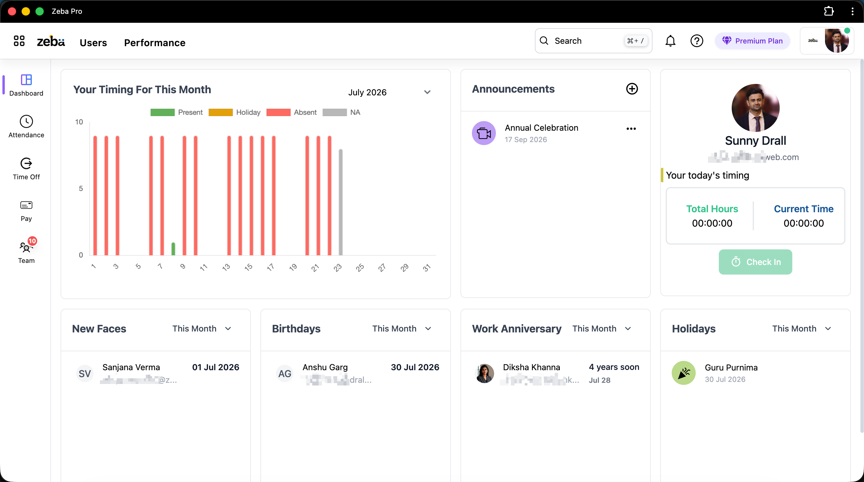
Zeba Pro has considerably more functionality than those five sections. We have hiring functionality, invoicing, employee documents, payroll, live location tracking, and much more. But having more functionality doesn’t mean we should crowd the screen.
After around 12 years working as a developer, one thing I’ve become increasingly convinced about is that the more choices you put in front of users at once, the more complicated your software starts to feel: even if each individual feature is simple. So while building Zeba Pro, instead of asking how we can fit more features into the navigation, we’re constantly asking what we can remove from it.
Why HRMS Software Becomes Complicated So Quickly
There’s a natural problem when building an HRMS. You start with attendance, leave, employees, and payroll. Then customers ask for documents, shifts, locations, skills, live location tracking, geofencing, onboarding, exit management, hiring, invoices, policies, reports, investment declarations, tax, and dozens of other things.
Every request is legitimate. So the obvious product decision is: "Let’s add another menu option."
Do that repeatedly for several years and eventually a new employee logs in and sees 20 items on the left side of the screen. Technically, you’ve made your HRMS more capable. But you’ve also made it feel more complicated. I don’t think those two things have to happen together.
The First Screen Shouldn't Explain Your Entire Product
Think about what a normal employee actually wants when they open an HRMS. Usually it’s something like:
- Did my attendance get marked?
- How many leaves do I have left?
- When is the next holiday?
- Where is my payslip?
- What’s happening with my team?
They’re probably not thinking: "Let me explore the company’s recruitment pipeline," or "I’d like to look at invoicing today." Those things might be valuable to somebody in the organization, but they aren’t valuable to this user at this moment. So why should we show them?
This thinking is why Zeba Pro’s primary HRMS experience centers on a simple structure: Dashboard → Attendance → Time Off → Pay → Team. The user starts with what they are most likely to need. Everything else exists without demanding their immediate attention.
We Took Inspiration from Google
One of the design ideas that influenced us came from outside HR software. Google has an enormous number of products: Gmail, Drive, Calendar, Docs, Sheets, Meet, and many more. But when you’re writing an email in Gmail, Google doesn’t put every Google product into Gmail’s primary navigation. Instead, there’s an app switcher. You decide when you want another application.
That principle made a lot of sense to us. Zeba Pro isn’t only becoming an HRMS; there are different applications and workflows within the broader platform. So rather than making one enormous navigation bar containing everything, we use an app-switching approach. If a user needs another Zeba Pro module, they can open the app switcher and seamlessly transition to areas such as Hire or Invoices. The navigation then adapts specifically for that application.
Technically Connected, Visually Focused
At the code level, these experiences live together. That’s our engineering concern, and the user shouldn’t have to care. From their perspective:
"I’m doing HR activities right now, so show me HR. Now I’m working with invoices, so show me invoicing."
We’ve deliberately created the illusion of smaller, focused applications even though they’re part of the same Zeba Pro ecosystem. For non-technical users especially, I think this makes an enormous difference.
Why Fewer Menu Items Matter for Non-Technical Employees
Building Zeba Pro for mid-market businesses and manufacturing companies has taught us a lot about usability. We have users with vastly different levels of comfort with technology.
Something that seems completely obvious to me as a developer isn’t necessarily obvious to someone working on a factory floor. With mobile app interactions, employees can still encounter location permissions, background application behavior, mobile data requirements, and application updates. These create support requests and friction.
You cannot design business software only for the person who understands software. If your company has 300 employees, your HRMS has to work for the least technical employee too.
We Recommend Biometric Attendance for Fixed Locations
This is something I think is important to admit when talking about simple HRMS software. We have a mobile application, and we obviously want people to use it. But for manufacturing workers at a fixed plant, we often recommend biometric attendance. Walk in. Punch. Done.
There’s no reason to make a factory worker open their phone, check permissions, and interact with an application simply because mobile attendance is newer technology. Good UX doesn’t always mean making your interface prettier; sometimes it means realizing the user shouldn’t need the interface at all.
Even App Updates Became an HR Problem
Suppose a manufacturing customer requests a feature. We build it and release a new version of the mobile app. Now the company needs its employees to update. Send everyone a message: "Please update your Zeba Pro app."
With a large workforce, some employees update and some don't. Now HR has to chase employees because we released a software update. That’s backwards. Software is supposed to reduce HR’s workload. So we introduced a force-update capability where the app itself requires the update when necessary. HR doesn’t need to become our app-update department.
Simple HRMS Isn't About Removing Features
I don’t want Zeba Pro to become simple because it does very little. Manufacturing companies have taught us exactly how complicated HR requirements can become. We support:
- Multiple shifts & night shifts
- Location-wise holidays
- Biometric & field attendance
- Geofencing & live location tracking
- Payroll automation & document management
- Exit workflows & skill tracking
The underlying product is becoming more capable, not less. The goal is to stop that complexity from leaking unnecessarily into the everyday employee experience.
Complexity Should Appear Only When You Need It
Don’t remove complexity that the business genuinely needs: delay it until the user actually needs it.
When an employee logs in on Monday morning to check their attendance, they don't need to see hiring workflows or payroll configurations. Show them attendance. When HR is configuring a complex night shift, that is the exact moment to show shift timings, grace periods, and attendance rules. Show complexity when it's needed, not before.
A Clean HRMS UI is Not the Same as a Pretty HRMS
There’s a tendency to describe software as having a "clean UI" because it uses modern fonts, whitespace, nice buttons, and colorful graphs. Those things make software visually attractive, but that’s not information architecture.
A genuinely clean UI is defined by what the user sees, what they don't see, how information is grouped, and how many decisions they are forced to make. You can create an incredibly beautiful sidebar containing 25 menu items, but it is still 25 menu items competing for cognitive attention.
Two Clicks Doesn't Automatically Mean Bad UX
There’s a common assumption in software development: Fewer clicks = better UX. I don’t completely agree.
If we put Hiring permanently in the main navigation, it takes one click to reach. If we place it inside the app switcher, it takes two clicks. Consider someone who uses Hiring once a month while checking Attendance every day. We’ve removed Hiring from their visual environment on hundreds of visits in exchange for one extra click when they actually need it. The objective isn’t to minimize every single click: it’s to minimize unnecessary cognitive load.
Designing Around Teams and Managers
Managers shouldn’t need to navigate through full system configurations either. A manager usually wants actionable information about their team. That's why we built user management around a central "Team" view in Zeba Pro.
From one location, managers can handle leave management, attendance approvals, field tracking, and employee requests. The software organizes itself around their objective—"What’s happening with my people?"—rather than our database structure.
How to Test Whether an HRMS is Actually Simple
If you’re evaluating user-friendly HRMS software, don’t ask the salesperson if the software is easy to use. Instead, give the product to someone who hasn’t seen it before without training them, and ask them to complete basic tasks:
- Where would you go to check attendance?
- How do you apply for leave?
- Where are your payslips located?
- How do you view your team's schedule?
Watch where they hesitate. If you run a manufacturing company, give it to someone who isn't comfortable with technology. Your HRMS doesn’t need to be easy for the salesperson demonstrating it; it needs to be easy for the employee who opens it twice a month.
What Building Zeba Pro Taught Us About Product Design
Developers naturally understand the architecture of their applications, where features live, and why modules are separated. Users don't, and they shouldn't have to. The architecture belongs to us; the complexity shouldn't belong to them.
As Zeba Pro grows, we will keep asking one question before adding any new option to the main screen: Does this user actually need to see this every time they log in? If the answer is no, we will find a better place for it. The best simple HRMS isn't the software with the fewest features: it’s the software that knows which features to get out of your way.


